All new pages and all pages made with the new editor are automatically responsive. However, you have to enable the function. You can access the dialog directly via the "Mobile" menu item in the Design Editor.
You can test how your page will look on a mobile device by clicking the "Preview" button in the top right corner of the menu:

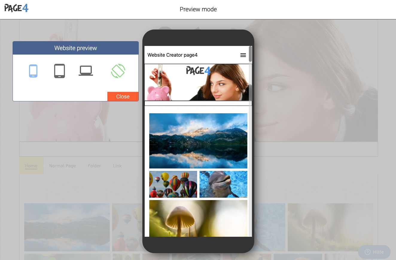
If you click on the preview, your page will be dimmed and a dialog with four icons and an area where your website will be displayed:

If you click on one of the three icons on the left, the stylized preview changes accordingly. With the fourth icon on the right you can rotate the preview. As you can see here, the page is displayed on a cell phone. If you can see three lines in the upper right corner (this is a so called hamburger menu) then the page is in mobile view. We have stored different widths for the different devices. Depending on the device or width, the website will be displayed differently.
Good to know: Via the link "More information" you get an explanation of what everything is adapted for mobile devices.
Tip:
Content elements on the header can currently only be optimized for mobile view to a limited extent and must therefore be hidden. If you want to place a logo on top of your website, we recommend you to use the logo option. A logo placed in this way is also optimally visible in the mobile version.