The navigation area must always be present, otherwise you will not be able to call the individual pages of your homepage in the browser.
The horizontal navigation has its own area like a header. You can freely design this area with the means of the design editor, i.e. set a background, add lines and much more. The height of the navigation area is flexible and is influenced by the type of navigation, font size and settings. There are two exceptions: If you place a navigation in a header, then the navigation no longer has its own area there to design. The navigation then always has a transparent background. Also a navigation you place in a sidebar has no own area, but is built in a transparent field.
You can choose between two types of navigation: a horizontal and a vertical navigation. With Page4 you are also able to use a combination of these two types. The system automatically regulates the distribution of the pages.
Designing the navigation in the design editor
The menu is quite extensive, as you can make a lot of settings. But once you understand it basically, it is very easy to use.

On the left side there are two menu items: Main Navigation and Sub Navigation (2).
Each navigation basically consists of levels. The main level and possibly several sublevels. If you create a navigation only horizontally, then the sublevels are displayed via a drop-down menu. The setting of such a navigation is always done via the item "Main navigation" including the sublevels. If you use only one navigation in the sidebar, it is similar. The subpages are also displayed in the sidebar and also here you only use the item "Main Navigation" to set everything.
As soon as you use a split navigation you need both menu items. Split means that the main level is horizontal and all sublevels are displayed in the sidebar. In this case you set only the main level for the main navigation (because the other settings are for the pop-up menu, which is not displayed) and in the sub-navigation you then set the other levels.
With the button "Select position" you can define where in the design the navigation should be placed. All areas where a navigation can be anchored are indicated by placeholders.
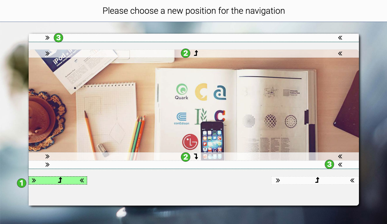
The current position of the navigation is marked in green (1). If the navigation is placed within an area, an arrow is displayed next to the <<>> placeholders (2). This affects the headers and the sidebars. It means the navigation area can't get its own background color then. All other positions (3) have only the placeholders <<>>. If a navigation is inserted there, it can get a background color and the area can even be backed with an image.
If you have positioned the main navigation, all pages will be displayed there, including the subpages. If you then position the sub-navigation, the sub-pages of the main navigation are automatically displayed in the sub-navigation. If you delete or remove (3) the subnavigation, of course no pages are lost, the main navigation then takes over the task of displaying all pages again.
If you want to leave the dialog for placing a navigation without changing the current positions, you can either click on the green marker, i.e. where the navigation is currently located, or simply outside the dialog.
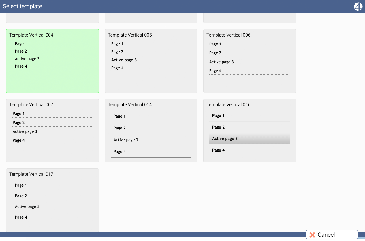
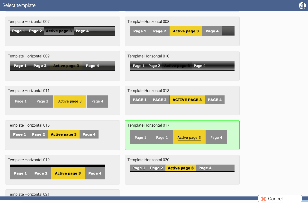
Templates (5) for the navigation
The look of a navigation depends on what settings (font, color, etc.) you specify and it is influenced by the template. Each template has different parameters and defaults. So it may be that certain settings have no effect because the selected template does not support or overrides these settings.
There are templates for vertical navigation:
General options (6) of navigation
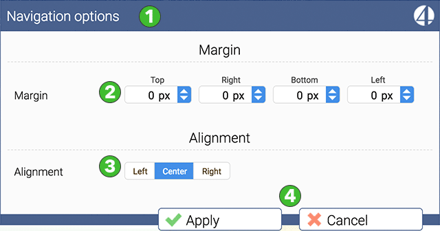
With the options (6) you can still adjust the look and also the placement. With the outer spacing you can extend the area of the navigation and determine where the entries are placed. For example, if you enter 20 px for the top spacing, the area will only expand upwards and the navigation will visually slide downwards.
With the alignment you can move your navigation to the left or to the right. Sometimes this setting may not be visible until you exit the design editor. Do not forget to save.
The color scheme of your navigation
You can design the first three levels of your navigation. All further levels take over the design of the third level.
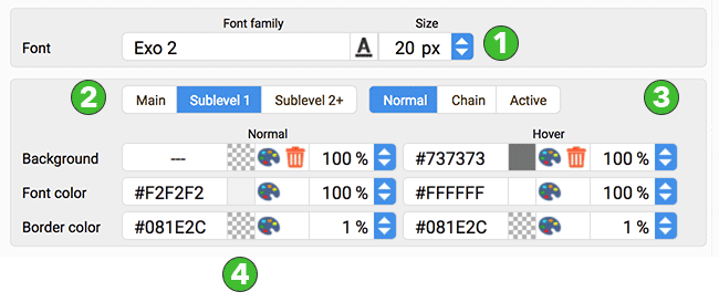
There are the following parameters:
(1) The font of the navigation. You specify which font and which font size you want to use. This setting is used for the main layer. All other layers get the same font, the font size is automatically reduced for the other layers.
(2) You can toggle the dialog for the three layers you can design.
(3) There are also settings for three "states". Normal is the state the navigation has when a visitor only looks at it. Quasi the idle state. Chain means you have clicked on an entry in the navigation and this entry has subpages and you have selected one of these subpages. In this moment the page which has the subpages takes over the state "chain" and shows, the called page belongs to me. When you call a page to view it, the state of the navigation point belonging to the page changes to "Active" mode.
Additionally a navigation point has two states, which are controlled by the mouse itself. The normal state (4) is that no mouse is over this navigation item. Hover" (5) is the event that the mouse is currently over an entry in the navigation. In the above example, the background of the navigation is transparent in the normal state and has a gray color in the "Hover" state. Let's assume that the background of the navigation area is green. Then the navigation in the normal state looks like this, that the entries are displayed with a white font on a green background. If you now move the mouse over a navigation point, the background color changes to gray, the font remains white.
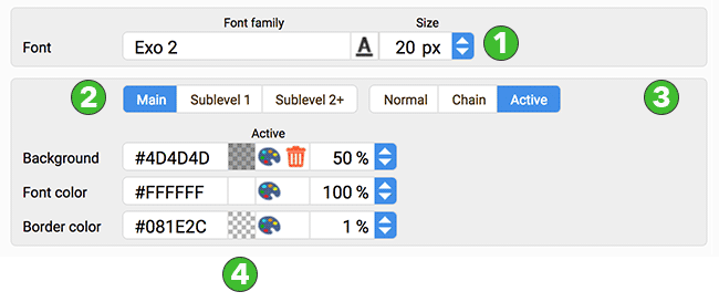
If a navigation point has the state Chain or Active there is no state "Hover. Therefore the option to set the colors for "Hover" is missing:
The preview (7)
In the general view at the top there is the point 7. On the left side of the dialog there is a preview. This is a very good way to check how your color settings affect the navigation. The preview is interactive, so you can test with the mouse how it looks when you move the mouse over a navigation point or how the pop-up menu looks.